Above The Fold Award: The 33 Best Online Agency Websites of 2016
#11 Agency Website: UpTrending
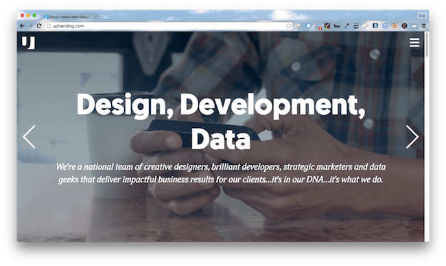
About UpTrending
Silicon Valley web designers UpTrending deliver technical support and strategic marketing services.
Little touches make a big difference
Trending font? Check. Collapsible menu? Check. Conversational copy? Check. A design to make a blogger jealous? Check. UpTrending is the epitome of Millennial – and it knows it.
How content should be done
From stats on the landing page to colloquialisms scattered through the copy and smiling faces at every turn, the content team at UpTrending know their brand, and they’re not about to let you leave the website without an introduction.
Behind the scenes
Running a host of powerful tracking and analytics platforms, including Marketo, Optimizely, Hotjar, and Rapleaf, UpTrending are in danger of collecting too many behavior metrics. Of course, they’re self-confessed geeks, they probably love the number crunching. Plus it boosted their score in the customer-centricity category.
Room for improvement?
Directions would be nice
You’ve got everything you need on this site, sure, but it’s all a bit clunky and more than a few visitors will find themselves retracing their steps to get somewhere new.
What can we learn?
Your website tells a story
A functional, engaging website should flow. It should tell the story of your agency and convince visitors that you’re a major player in their own success story.
#10 Agency Website: Rentify
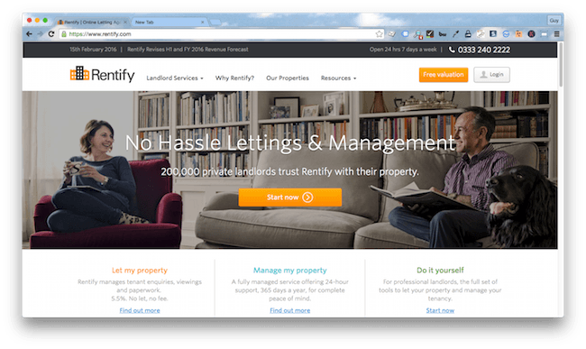
About Rentify
Rentify provide marketing and management services to private landlords.
Using every tool in the box
Operating in a niche market, Rentify’s targeted audience gives it an advantage in the customer-centric category. But the Rentify team aren’t relying solely on that, they run a host of tracking, analytics, and marketing automation tools.
Performance matters
A surprising high scorer in the technical category, the Rentify site is one of the best for speed and page weight. Customer data is also well protected with the implementation of HTTPS.
Top notch navigation
Whether it’s the link to the blog in the header, the simple menu, or the veritable feast of links hanging out in the footer, it’s fair to say Rentify nailed navigation.
Room for improvement
Rethink the homepage
The Rentify landing page could do with a spruce up. The amount of content on there is a little overwhelming, the color scheme is underwhelming, and the information on the page gets lost somewhere between the two.
What can we learn?
Presentation is important
To be honest, if we hadn’t been scoring these sites on performance and function as well as aesthetics, I’d have bounced right off Rentify’s homepage and never returned. Being a little creative about how you include and present information can have a big impact on engagement.
#9 Agency Website: Panoply
About Inflow
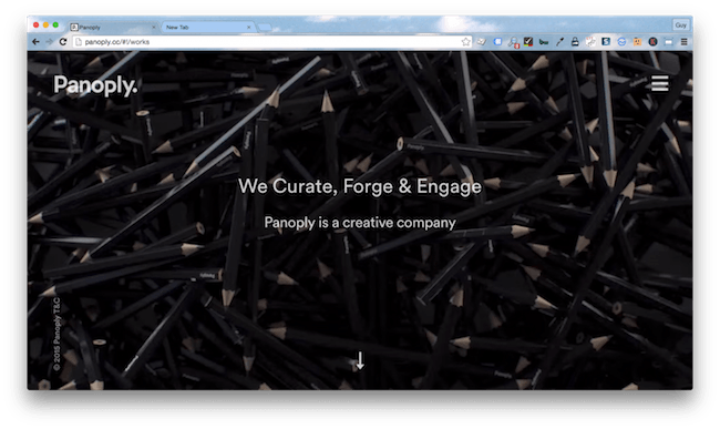
Creative agency Panoply are content specialists, providing advertising and communications strategies for digital, broadcast and print media.
Simple and effective design
One of the highest scorers in the design category, the sleek, one-page structure and minimal content ensures you won’t forget Panoply.
Mobile friendly
If you thought the edgy design would impact performance on mobile devices, think again. This responsive site scales beautifully and looks great on even the smallest screen.
Imagery is valuable content
No stock images for these guys. From simple, understated images to thought provoking, creative animations, Panoply nailed content with unique imagery.
Room for improvement
Style triumphs over substance
Want a detailed understanding of exactly what this team does and how they can help your business? You’ll have to pick up the phone, the website is an introduction only.
What can we learn?
Maximize ROI with a multifunctional design
Flashy is great, but let’s not forget your site has a job to do. The Panoply design is impressive, but it goes light on the analytics and tracking resources and fails to provide a detailed understanding of the agency’s services.
#8 Agency Website: Arcane
About Arcane
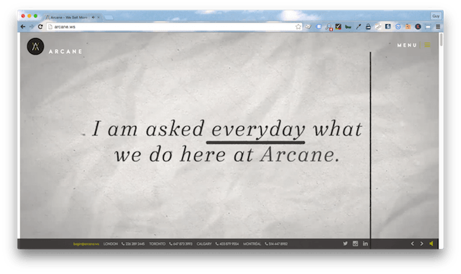
Disruptive marketing agency Arcane provide innovative marketing solutions to big name brands.
Functional design
A great combination of video, imagery, and copy all integrate seamlessly into a sleek, one-page design. The Arcane site delivers heaps of information without overwhelming the reader.
Perfect content
Arcane uses a little creative flair to simultaneously introduce the brand, its achievements, ethics and value proposition.
Communication made easy
Arcane’s opaque footer bar that scrolls with the screen is a creative way to ensure users always have access to contact information.
Room for improvement?
Slow and steady doesn’t always win the race
Data heavy sites might look good once they’ve loaded but, with an 11 second load time, impatient users aren’t going to wait around to see what Arcane has to offer.
What can we learn?
Think outside the box
Arcane shows that, when it comes to website design, breaking the mold can really help to set your marketing agency apart from competitors.
#7 Agency Website: SteelHouse
About SteelHouse
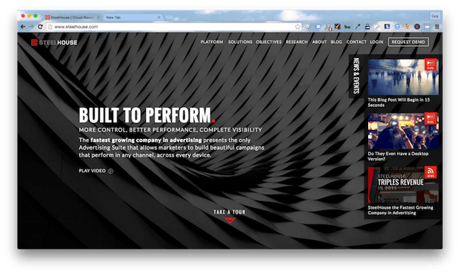
Digital agency Steelhouse delivers analytics designed to enhance strategic marketing.
Content and design in harmony
A great example of what you can achieve when content and design acknowledge each other, the SteelHouse site is impeccably well structured and delivers relevant content targeted to every facet of its audience.
Let’s connect
Availability of contact information was a major measurement in our usability category. SteelHouse nailed it with an unimposing contact form sitting in the footer of each page.
Dressed to impress
From the distinct color scheme to well-chosen graphics and carefully curated content, this site is a big hitter in the design category. Sleek, impressive, and memorable.
Room for improvement
Some juice would be nice
Sites simply can’t afford to be anything less than perfect on the technical front. A data gobbler that takes ages to load is going to lose impatient users. SteelHouse dropped major points in the technical category for both offenses.
What can we learn?
Content should work with design
The SteelHouse website is a great example of what happens when you unite content and design. Working in harmony, these two elements enhance usability, engagement, and performance.
#6 Agency Website: Persado
About Persado
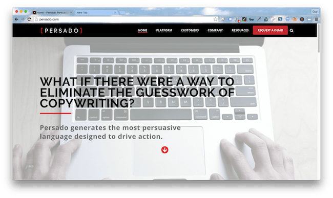
Persado’s persuasion automation solution is designed to automate the copywriting process.
Champions of the sales floor
Persado scored highly for both content and design. The site is well laid out and designed around the journey to sale. A prospect can easily find the information they need, whatever their motivation for visiting the site.
Focused on usability
With a helpful CTA sitting in the menu, an uncomplicated contact form, and introductions to the product in multiple formats, Persado’s team have really focused on engagement and usability.
Fast and mobile ready
A lot of thought has gone into optimizing the Persado site for mobile browsers. Heavy pages with lots of media feature viewport meta tags, controlling how videos are displayed on mobile devices and ensuring they aren’t simply squashed to fit the screen.
Room for improvement?
Security could be stepped up
Using HTTP, the site is at greater risk from man-in-the-middle attacks than sites using Hypertext Protocol Secure (HTTPS). The Persado site doesn’t feature an e-commerce element, so we didn’t detract too many points from its technical score, but it is worth noting that there is a greater risk of hackers gaining access to the information submitted through the contact forms.
What can we learn?
Understand the role of your site
The primary purpose of any marketing agency website is to sell that agency’s services or products. By designing their website around the journey to purchase, with information targeted to upper, middle, and lower funnel enquiries, Persado maximizes the value of its site.
#5 Agency Website: SundaySky
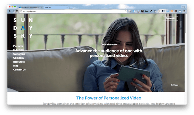
About SundaySky
SundaySky’s SmartVideo technology is redefining lead generation, helping brands to target individuals with fast loading video content.
A product showcase
If you are selling solutions that promise sleek delivery of video content, then a website showcasing your work is a great way to go. Very well styled, whatever size screen you’re watching from, the homepage features engaging videos that effortlessly introduce the agency and its services.
Customer focused
This site scored highly for customer-centricity, as well as design. With a contact button easily accessible and tracking and analytics platforms Hubspot and Google Analytics integrated into the site, SundaySky have worked hard to optimize the visitor experience.
Faster than a speeding bullet
While it lacked the speed of websites such as Smartling and Moz, SundaySky’s was one of the few sites to achieve top performance scores from both PageSpeed and YSlow. At four seconds, the load time is still well below average, and it goes easy on the data. Impressive given the amount of visual media.
Room for improvement?
Navigation could do with a tweak
It’s fair to say that navigation could be a little easier. The main menu sits off to the left and, from a design point of view, looks very sleek. Top menu items are obvious, but if you want to navigate to the ‘about’ page, you’ll have to click on ‘company’ to reveal it. Not a deal breaker, but something to consider.
What can we learn?
Set yourself apart
Play to your strengths and don’t be afraid to be a little bit different.
#4 Agency Website: Localytics
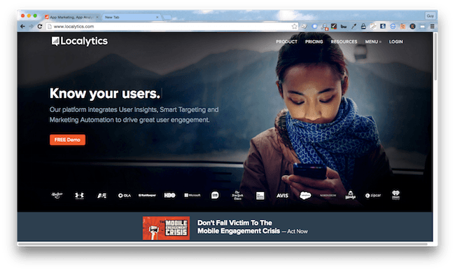
About Localytics
App marketers Localytics’ mobile platform is designed to enhance engagement.
Little things matter
There are some great, innovative styling ideas on the Localytics site. We were rather taken with the animated copy on the homepage – a great example of how to draw attention to your USP.
Creating a journey
This site ticks the content boxes, delivering a comprehensive overview of the agency’s products and services while catering to prospects at every level of the sales funnel. The tour feature is a fantastic example of how to introduce and sell a product your audience aren’t familiar with.
Upfront and honest
A comprehensive pricing table was one of the reasons Localytics dominated the usability category. Letting visitors effortlessly compare its products with competitors is a great way to highlight a value proposition.
Room for improvement?
Speed matters
Neither PageSpeed or YSlow were particularly enamored with this site, which lost it a few marks in the technical category. At 5.4 seconds, the load time was still below average, but well over double that of some of our higher ranking agency websites.
What can we learn?
Know your audience
With a thorough understanding of its audience and a focus on usability and customer-centricity, Localytics delivers an engaging website subtly geared towards lead generation.
#3 Agency Website: EVB
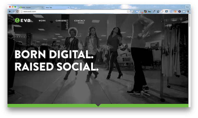
About EVB
Brand development agency EVB provide services across digital, advertising, social and tech. They are not cat people.
Hats off to the copywriters
The content site-wide was hands down one of the best we saw for the entire shortlist. Snappy, clever copy that (shock horror) actually conveys a message, styling that asserts the agency’s personality and a great example of how to showcase creative work. Well done EVB.
A fast loader
It’s a tad data hungry, but the site loads at a good clip and works well on mobile devices, so the majority of users who click on it, will actually land on it.
Functional
You won’t get much further down this list without realizing that a lot of marketing agencies struggle to balance creative design with function and performance. Not EVB, this site is easy to navigate, engaging, and individual.
Room for improvement?
Metrics would be nice
Unlike other winners, EVB went light on the analytics and tracking tools, limiting the insight it can collect on user behavior and shaving a few points off it’s customer-centricity score.
What can we learn?
Charm your audience
In case you hadn’t guessed, this site was one of my favorites (don’t worry, all judging was impartial). Personally, I’m all for bold colors, great designs, and faces to a name. It made me remember the agency and left an impression of the people behind the brand.
#2 Agency Website: Stratabeat
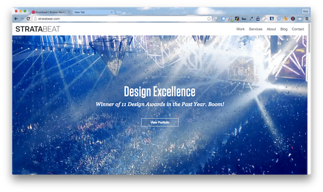
About Stratabeat
Stratabeat is a marketing and design agency with a strategic focus.
Designed to impress
The content is arranged purposefully, the site structure leads to logical endpoints, and the color scheme is smart and snappy but doesn’t overwhelm. The Stratabeat website could teach us all a thing or two about functional design.
Hot footed
How many of us wait around for a slow-loading website? Very few. Not an issue for Stratabeat, this site is quicker on its feet than a babysitter’s boyfriend when the car pulls up.
Industry leaders
Content was one of the broadest and hardest categories to score. And Stratabeat won it. This was the only agency that successfully aligned their communications strategy with their brand. Every little piece of content here subtly tells a story, it stands alone and paints a bigger picture. By the time you arrive at the contact page, you’ve had the thought placed in your head, “These guys are the best in the industry” and you’ve never once seen those words written in full.
Room for improvement
Daring never hurt anyone
The Stratabeat site ticks all the boxes, but it makes no effort to think outside of them.
What can we learn?
Practice what you preach
Stratabeat’s strategic focus is evident in the design, structure, and content of the site. The agency plays to its strengths and sets itself apart from competitors.
#1 Agency Website: Portent
About Portent
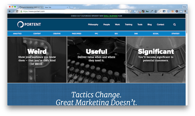
Full-service digital agency Portent specializes in PPC, SEO, content, analytics, strategy, and social media.
Investing in design
Isn’t it nice when a site is designed around content? There is a vast amount of information available on the Portent website, and it is so well displayed that the site never feels crowded or overwhelming.
Champions of analytics
When it comes to measuring visitor behavior, the Portent team are way ahead of the curve. They combine metrics from common platforms like Hubspot and Google Analytics with marketing automation tools such as Rapleaf and the analytics platform Bizible.
Fast and mobile friendly
Responsive, quick to load and optimized for mobile devices, the Portent site works perfectly, wherever you are.
Room for improvement?
We’re not feeling the blue color scheme
The Portent site is slightly redeemed by the fact that it’s the first marketing agency website on our list to opt for a blue color scheme. But it won’t be the last.
What? You like blue? Well, so does everyone else. In fact, it wins the popularity contest in most studies by an overwhelming margin, regardless of demographic. A nice, safe choice. What could be better?
What can we learn?
Treat your website as a valuable resource
Investing in appropriate analytics and tracking tools help you understand your audience, their wants, needs, and behavior.
Wrapping things up
The best marketing agency websites successfully juggle functional and fabulous. These are the sites that have a purpose, and the brands that understand how to get the most out of their greatest lead generation tool.
Want to follow their example? Identify what you need from your site, what your visitors need, create a strategy and don’t be afraid to be creative. Of course, if the metrics tell you your version of creative isn’t working, be flexible enough to change direction.
And if you or somebody you know is getting bent out of shape over our awards, just remember the wise words of Jerry Seinfeld.
Read about the website navigation best practices
View all posts filed under “UX & Design”
Most newsletters suck...
So while we technically have to call this a daily newsletter so people know what it is, it's anything but.
You won't find any 'industry standards' or 'guru best practices' here - only the real stuff that actually moves the needle.
