The secrets to creating ads that win the click (and convert!)
Traditionally, there are two types of advertisers: the ones that know every nook and cranny of the platforms they use and those that just make amazing ads.
But the best advertisers are geeky and creative.
Book a 30 minute call
Reserve 30 minutes with a strategist and get 30 hours worth of value.
These folks know what works on each platform, understand their audience, and pay attention to data. And they also have a knack for design. They create winning ads that are so on the nose that they bully their competitors out of the auction.
Yet becoming one of these double threats is easier said than done. So in this piece, we’ll discuss why ads are important, what works on various platforms, and share several examples of ads that have made products fly off the shelves.
Why are ads so important?
Marketers and advertisers have been trying to sell things for hundreds of years. But we’ve seen that accelerate so fast in the digital environment that it’s almost impossible to keep up volumetrically. So great ads are important because you’ve got seconds to grab people’s attention.
Conceptually, I like to say that brand advertising is about making people feel things, whereas marketing is making people do things. But in this digital age, those two are more intertwined.
It’s a unique challenge to convince people to do things and make them feel something in today’s digital environment. Unlike minutes-long TV ads, you’ve only got a few seconds to get someone to engage. And the strategy behind those ads is different across every ad platform.
Two elements that make an effective ad
There are a couple elements an ad powerful 一 regardless of the ad platform you’re using:
- Knowing your audience – You need to convey that you understand your audience’s problem and that your product or service is the solution. If you can’t identify a potential customer’s real issue and present an answer quickly, they won’t pay attention to you.
- Relevance – Again, you don’t have much time or space to attract someone’s attention, so your ad needs to be highly targeted. Extraneous copy detracts from the point you’re making.
How to design and run effective Google Ads
There’s a general trend happening with Google Search: Google wants to do the work for you. You need audiences, they want to build them. You need an automated bidding strategy, they want to set it up.
Some people are skeptical of that, and rightly so. Google is a publicly-traded company. They’re making money. And they’re not just helping their customers altruistically. So there are some guardrails you want to put in place to ensure that Google delivers tangible results for you and your business:
- Think of designing an ad that fits in a postage stamp – Your ad needs to be very small and quick. The upside to Google ads is that your potential customer has already searched for something specific, so brevity works well.
- Keep your visuals simple – You don’t have the space to show off a complex visual. Anything that looks beautiful at 300 x 300 will look terrible in a small format. Your ad needs to illustrate your point as simply as possible.
- Shorten your copy as much as possible – Unfortunately, long company names and product titles work against you. When you’re trying to get the customer’s attention, a short, pithy, useful headline is best.
- Monitor your click-through rate – You want at least a 5% click-through rate (CTR). If it’s lower than that, chances are your ad can and should be improved. The higher you can get your CTR, the more relevant Google considers your ad. You’ll be rewarded with cheaper clicks, more clicks, or a better position at lower costs.
- Look at or buy search query data – When you know what people are searching for, it’s much easier to write a responsive headline. I suggest writing one or two headlines for each term searched most often.
- Switch up your bidding strategy – Google has a cost-per-click bid strategy by default. This automatically increases the possibility that your ads show up on spammy sites. Changing your bidding strategy to viewable CPM can ensure that your ad is displayed on reputable sites.
- Be disruptive – At this point, people are developing ad blindness. They discount everything they see in the right sidebar or the header of a site. So pay close attention to your color palette, the type of ad you’re running, and your copy. Make it provocative or shocking. It should jump off the page and draw people in.
Keep in mind that these tips don’t just apply to Google Ads. They also apply to Facebook, Instagram, and any social platform.
How to break through the noise with winning Facebook Ads
I have been through Facebook Feed, Facebook Mobile, Facebook Canvas Ads. And with every iteration, there are a few things that have remained true:
- You are constantly fighting the content of other users – You’re competing against people’s babies, dogs, and vacation photos. So you have to try hard to get people’s attention. Therefore, pattern interruption is non-negotiable.
- Facebook is very mid-funnel focused – People may know who you are but aren’t necessarily prompted to take action.
- Facebook is ephemeral – Anything that would’ve lasted in direct mail or TV for a quarter lasts in Facebook for about a week. So you’ve got a very short window to deliver your message. To keep it fresh, I typically create several ads to feed the platform.
- Concentrate on audience management – Most people aren’t on Facebook to buy stuff. You need stopping power. You need them to stop and think about what you’re selling.
- Consider Facebook a multi-click purchase – Unless you’re selling something less than $50, customers will need time to consider their purchase. So organize your audiences in a way where you can progress people through a funnel. Your campaign will be the top of the funnel. Anyone that interacts with the broadest, highest stopping power ads should be enrolled as the audience in campaign B. In campaign B, you show a different set of ads geared toward someone with higher purchase intent. And so on.
- Your description is really important – Of course your image is the first thing people see, but the copy is equally, if not more interesting. If it’s an information-heavy sale, like if you have to meet with prospects multiple times and give them a lot of information before they actually buy, you can actually do a lot of useful damage with that description text. You can assuage real objections and position yourself well against the alternatives. And if people actually read the text, that’s a powerful signal in Facebook’s algorithm.
An example of a great Facebook Ad campaign
Auvere is an exclusive, high-end jeweler. So our first ads showed some gorgeous photography of a model with Auvere earrings. These ads were designed to showcase that Auvere was expensive and worth paying for.
When you buy a piece of Auvere jewelry, you can pass it down through generations. That was the way we introduced the product. And as we continued to move forward through the funnel, we found that people knew who Auvere was.
Then, we started showing testimonial ads or being a little cheekier, saying things like “Looks that sleigh” around the holidays.
But if we’d started with ads that showed a suite of products and the price, we wouldn’t have reeled as many customers in. Instead, we took our time. We showed customers the value, showed them testimonials, and then started to bring them the door in with more disruptive ads.
To make sure you’re getting this right, consider reporting on meaningful engagement with ads or landing pages over the last 30 days.
What creatives are working on LinkedIn Ads right now
Long-form video is winning out on platforms like LinkedIn.
For instance, we’re running very long-form ads for Webmechanix on LinkedIn 一 up to 30 minutes long. Our goal isn’t to convert. It’s to test the hypothesis that if we keep people on the platform, we’ll be rewarded with cheap engagement.
And we’re seeing it work.
LinkedIn is historically expensive compared to other platforms. If you’re running a normal video or even an image ad on LinkedIn, you’ll see CPCs of $10 to $15, maybe even $25 depending on your specific audience.
We’ve only spent $500 on a very specific audience and we’re getting 50% video views. This translates to people watching 15 minutes for $4 a pop. So taking an extra informative approach, as opposed to hard selling, can be a lucrative way to design your LinkedIn ads.
What you need to know about User-Generated Content
User-generated content or UGC is becoming exceedingly popular. In this day and age, you can’t escape the power of an influencer. Audiences are engaging with their favorite influencers every day. They want to know what these people are doing and religiously watch influencers’ stories.
And that’s why UGC ads are so popular.
What makes these ads work is that they feel authentic. Influencers have believable urgency and they know how to connect with their audience. They use language that’s easy to understand.
And perhaps most importantly, they can preview the rest of the buying process so that it looks familiar when prospects go through the next step in their journey. Designing landing pages that look and feel exactly like an influencer said they would demonstrates credibility.
The biggest mistakes people make when developing ads
Several common mistakes people make during the creative process are fairly avoidable.
The first is not listening to the data. Even if you think you have a great brand and know what your customer wants, there’s no way you can just run an ad and hope it breaks through. You have to be nimble. You have to pivot when something’s not resonating.
Another thing I see is the definition of insanity: trying the same thing over and over and expecting a different result.
Instead of blaming the platform, you must go through trial and error. Learn from what you’ve already tried and tweak and test your ad until it works. You have to constantly look at what you’re doing, measure it, and then ensure that it answers.
The third mistake is thinking that your brand will save the day. Sometimes a brand is hard for people to understand. You’re in for a bumpy ride when you push a piece of branded content into the lower funnel, and a customer has no idea what you do. It is imperative to understand where your prospects are in the buying funnel and make it clear what you’re selling.
3 examples of winning ads
It’s easy to find bad ads 一 they’re all over the internet. But good ads are hard to come across and even harder to describe. So I’m going to take you through a few that performed extremely well.
LensPure
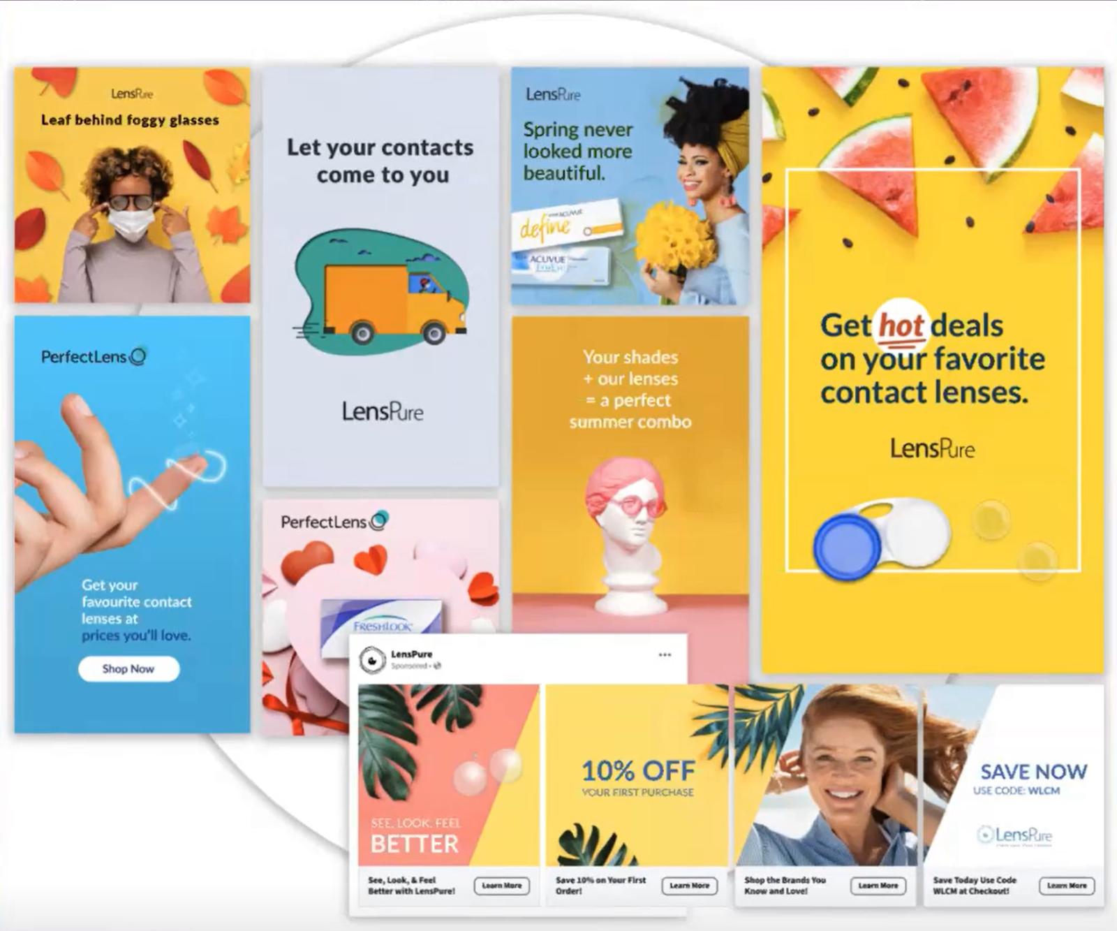
LensPure is a contact lens company. The problem they know their customers have is that lenses are expensive. You have to go through the trouble of seeing an ophthalmologist, getting your prescription, and then filling it. Although the previous ads sort of touched on this, there was no joy in the act of getting contact lenses.
So the stopping power we used in this ad was the excited nature of it. The copy was relevant, and the colors made people stop and say, “oh, that’s cute.” We also intentionally used seasonality to make people want to make a change. The carousel ad also performed well because each part could stand alone but subtly pushed the customer to run through each card.
Kettlebell Kings
Kettlebell Kings is a weight training brand, so we wanted to showcase the results customers could get if they used their workout products.
In this case, great photography was crucial. We could direct users’ eyes towards the models’ muscles by combining fantastic photos with pattern interruption. The yellow visual cues also helped break up what could’ve been a monotonous series of photos.
This campaign was paired with considerable discounts, and I can’t say enough what a great offer can do to your campaign. The company sold through its inventory twice.
Hard Assets Alliance
Hard Assets Alliance is a company that sells titles to gold. This ad campaign was challenging because the usual appeals of buying gold or coins have been practically beaten to death.
But what was unique about our client was when you purchase the gold, they hold onto it for you. So you don’t have to worry about where it is – it’s secure.
So we wanted to emphasize that gold is a timeless value and that Hard Assets Alliance puts a modern spin on holding onto that asset. Pairing “timeless value” and “modern convenience” copy with photos that conveyed the same feeling helped us double down on that messaging.
Start creating ads that convert
At its core, advertising is about understanding your audience, data, and overall trends. While I can’t tell you exactly how to design your ads, I can tell you that keeping these three tenets in mind is paramount. So take the time to interpret your data. Run tests. Experiment. And learn what makes a showstopper and what doesn’t.
If you’d like some guidance, don’t hesitate to reach out to WebMechanix. Our creative experts are here to help you determine your audience’s wants and needs and how to deliver that perfect message to them. You can get in contact with us here.
If you want even more killer digital marketing advice, come to our next session of The Growth Clinic. We host them every Wednesday at noon EST. Register here to join us.
Most newsletters suck...
So while we technically have to call this a daily newsletter so people know what it is, it's anything but.
You won't find any 'industry standards' or 'guru best practices' here - only the real stuff that actually moves the needle.


