14 Ways To Boost Sales From the Best Ecommerce Facebook Ads
Love it or hate it, Facebook is a marketing juggernaut.
Worldwide, it’s expected that Facebook and Instagram advertisers will spend an astounding $95 billion in 2021—all vying for a slice of the pie generated by 2.45 billion active monthly Facebook users, 1.62 billion of which visit the site every day.
This makes Facebook one of the most competitive global advertising platforms, with only the very best ecommerce Facebook ads cutting through the noise. There’s a great chance the people you’re looking for are on Facebook.
That’s why you need to know how to combine winning design and copywriting ideas with well-planned targeting strategies to give your next campaign the fighting chance that it deserves.
So, we’ve compiled this collection of 14 of the best ecommerce Facebook ad tips and tricks, together with examples to show you how they work in action.
But first, let’s look at the reasons why every ecommerce business should consider Facebook advertising, as well as some of the most popular types of Facebook ads for ecommerce.
Why Use Facebook Ads for Ecommerce?
Advertising on Facebook is a form of pay-per-click (PPC) or cost per thousand impressions (CPM) advertising, which most people are familiar with on Google. But there’s a noteworthy difference.
Ads on Google are given priority over organic results and appear in response to a person’s search query. So, if someone’s searching for new luggage, they may see this:
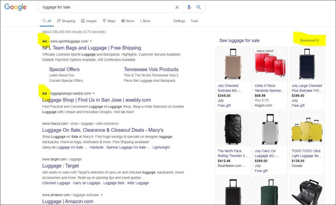
Facebook ads, on the other hand, appear in users’ social feeds, usually intermingled with organic content.
Advertisers can select their preferred audience from customizable parameters like age, gender, profession, buying behaviors, location, interests, education, relationship, consumer behavior, and even life events.
So while Google helps people find users who need help with what they’re looking for, Facebook, helps advertisers to find customers by interrupting their browsing behavior.
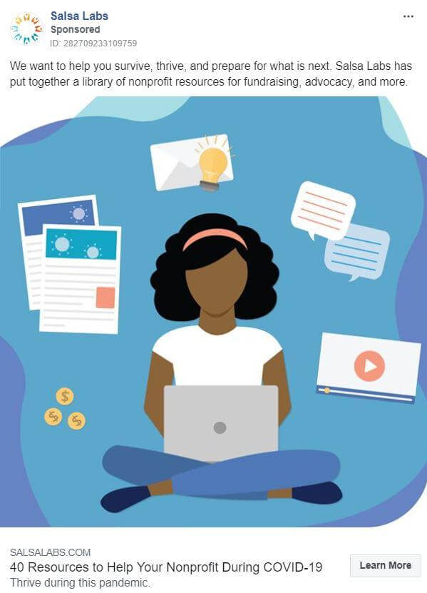
It’s a subtle but important distinction—advertisers on Facebook can target local customers at a very granular level or pay to pop up in the news feeds of nonprofit executives across the country, like this:
In addition, because the lines are blurred between paid ads and organic posts on Facebook, many advertisers are using techniques such as video interviews and long-form Facebook ads, all designed to move their customers through the sales funnel.
This ability to align a product or service directly with a customer’s sphere of interest and deliver content in a range of different creative formats makes Facebook a truly dynamic advertising platform. It’s also the reason why ecommerce Facebook ads strategies are becoming more widely used as high-conversion tactics.
Types of Facebook Ads
So you’re eager to get started with Facebook ads for ecommerce. Great! But before you jump in and get to work, you’ll need to know your options. Here’s a brief look at some of the ways that you can advertise on this platform.
As the name implies, an image ad consists of one or more images, usually with text overlays. There are two types of image ads on Facebook:
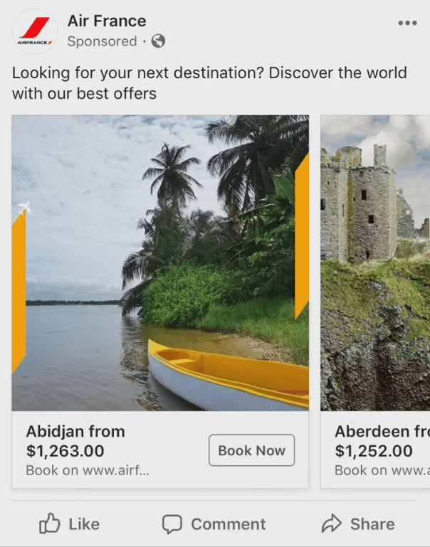
Carousel (Canvas) Ads
These are your typical image slideshows that users can swipe through. They’re a great way to provide extra information about your product or engage users in order to get them to take your desired action. It’s recommended that you stick to 3–5 images to avoid overloading users with information.
Canvas ads provide a full-screen mobile experience similar to AMP—you can mix and match elements such as text, video, carousels, and more to drive user engagement. These work well if you have lots of products that you need to showcase, if you have a poor landing page experience on your website, or if you need to explain the product or service in more detail than an image or video alone would allow. Essentially, you can think of these ads as pseudo landing pages that are packed with information.
Single-image Ads
There’s not much to elaborate on here! Facebook has some good design recommendations for single-image ads. We recommend using these ads if you want to keep users focused on your CTA, without distracting them.
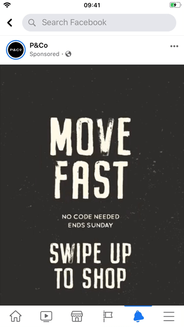
Note that image ads on Facebook follow a 20% rule, where your ad is less likely to be shown if text accounts for more than 20% of the content.
Video Ads
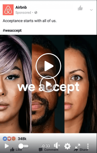
Facebook’s algorithm prioritizes video content above everything else, including text and image ads. As with images, you have two options:
- Slideshows. The video itself cycles through still images, sometimes with text overlays. This format works well if you need to promote multiple products but don’t have the budget or time to create a lengthy demo video.
- Single videos. These are just your standard video ads. They’re a great way to generate awareness or provide additional information about your service or product.
Video ads are subject to the same 20% rule as images are. Remember: The video itself is the main focus; any text should be supplementary. The same goes for audio—your video should make sense both with and without it. For the best results, you should also keep your video duration under 30 seconds.
14 Design, Copywriting, and Strategy Techniques Used in the Best Ecommerce Facebook Ads
We’ve seen that there are different types of Facebook ads. But what is it that makes some ads better than others?
Let’s now take a look at some of the best ecommerce Facebook ad examples to explore the anatomy of a winning Facebook ad.
1. Use Eye-Catching Images in Your Ads
Facebook users scroll and skim until a particularly interesting image stops them in their tracks—which is why images are arguably the most important element in Facebook ads.
Here are a few pointers to help you stand out from the crowd:
- Keep it simple: People access Facebook primarily from mobile devices. In fact, 94% of Facebook ad revenue comes from mobile users according to marketing software expert Sprout Social. Avoid including tiny details that are hard to spot on a mobile device or overloading your ad with text (remember the 20% rule!).
- Make the most of the space you’re given: This is especially true for mobile, where ads that take up more space are more likely to be read by users as they scroll through their feed.
- Use contrasting colors: Bright primary colors are best. But whatever color scheme you use, make sure it contrasts with the Facebook blue and white so that your ad doesn’t blend into the page and get lost in the usual noise.
- Include faces: Human faces—especially ones that are smiling—usually capture a viewer’s attention better than inanimate objects. Make sure the people you use are relevant to your target market or demographic.
- Use high-resolution images: The sharper your image, the better. It’s more eye catching and reflects better on your business.
- Avoid text overlays: Using just a few focused words or numbers can make your images much more powerful. But don’t go overboard—keep your text easily digestible so that it doesn’t steal attention from the image. The less words, the better.
We mentioned above that your ad’s space utilization is an important consideration. To make the most of the space that you’re given, you’ll want to use the right aspect ratio for your Facebook ads. The aspect ratio you should use depends on where you’re showing the ads:
- Facebook and Instagram feeds: 4:5 aspect ratio, but you can also use 1:1.
- Facebook and Instagram Stories: Most people hold their phones vertically, so we recommend a 9:16 aspect ratio to capture the full screen. You can also use 4:5.
- Video carousel format: 1:1, and consistent ratios for all the videos in a carousel.
- Facebook and Audience Network in-stream video: stick with 16:9.
Example and Why It Works:
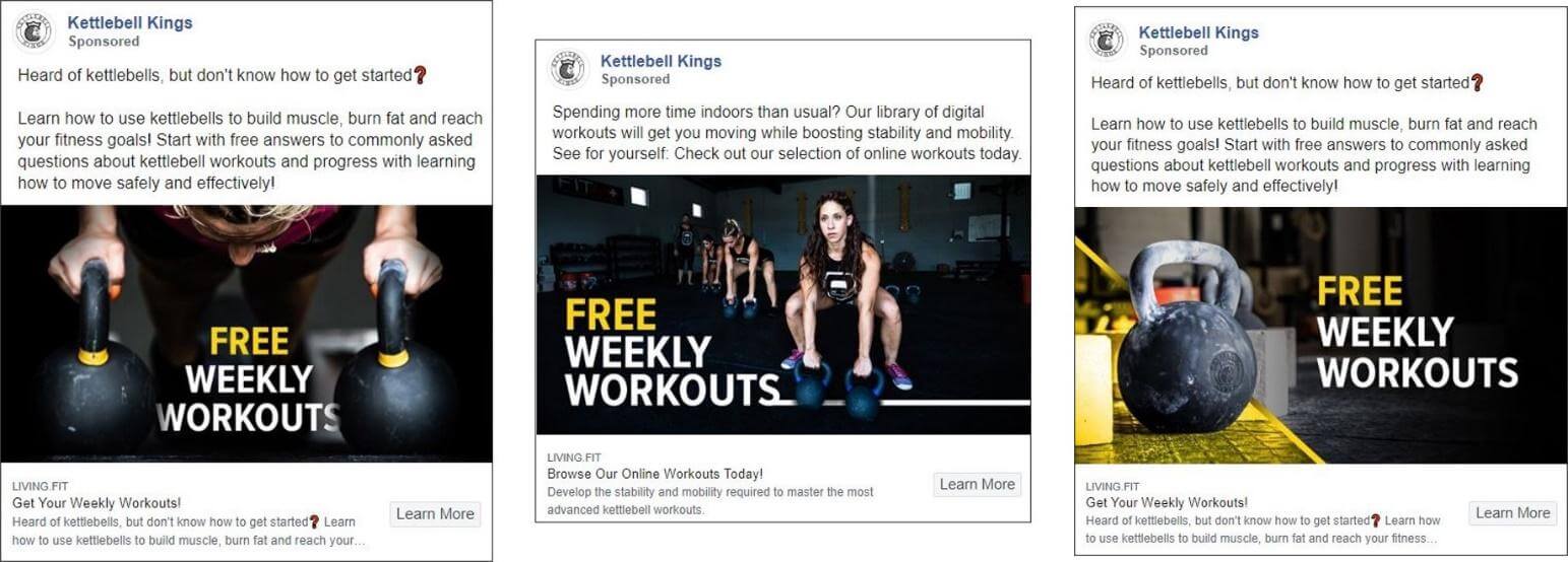
Kettlebell Kings uses a series of related images that incorporate most of the attention-grabbing pointers mentioned above:
- Simple enough for mobile devices.
- High quality.
- A pop of bright yellow to catch the eye.
- Relevant human faces.
- Minimal and clear text overlays.
2. Engage Your Audience with Compelling Copy
Images, graphics and videos may be the most important elements of a Facebook ad, but the words come in at a close second. In fact, the two are inseparable, so make sure they play nicely together.
- Knock ‘em dead with your headline: You have about two seconds—maybe less—to grab someone’s attention on social media. Your headline has to leave an immediate mark, so keep it short and punchy. This applies to text overlays as well as headlines.
- Focus on benefits, not features: Users don’t care about how fast your software runs or the thread count of your sheets. They want to know if your product can make them smarter, healthier, or happier than your competitor’s product. So, focus on their needs, not your features. Additionally, be mindful of the message that you’re sending. Some ads, like ones that focus on getting rich or losing weight, have faced major scrutiny on ad platforms like Facebook.
- Keep it simple: You may be a master linguist, but Facebook ads aren’t the best place to show that off. Pare it back—use simple words and short sentences to keep your message accessible.
- Keep it clear. Get to the point immediately and be crystal clear about your offer or product benefits.
- Use numbers: The human brain responds quickly and intuitively to numbers more than it does to textual descriptions.
- Use clickable words: There are certain power words that trigger a response more than others. Examples include “you,” “free,” “exclusive,” “learn,” “now,” and so on. These power words evoke powerful emotions like desire, greed, curiosity, or fear, and they should be sprinkled through your ad to encourage users to take your desired action.
Now, when it comes to copy, you’ll want to be mindful of the character limits on Facebook, particularly for ads on mobile. Here are the rough numbers:
- Top Copy: ~100 characters. If you exceed this limit, be sure to include the most important copy first, as it can be truncated at any point after this without warning.
- Headline: ~25 characters. Check to make sure that this is not cut off on mobile. The headline should never be truncated.
- Link Description: ~30 characters.
Example and Why It Works:
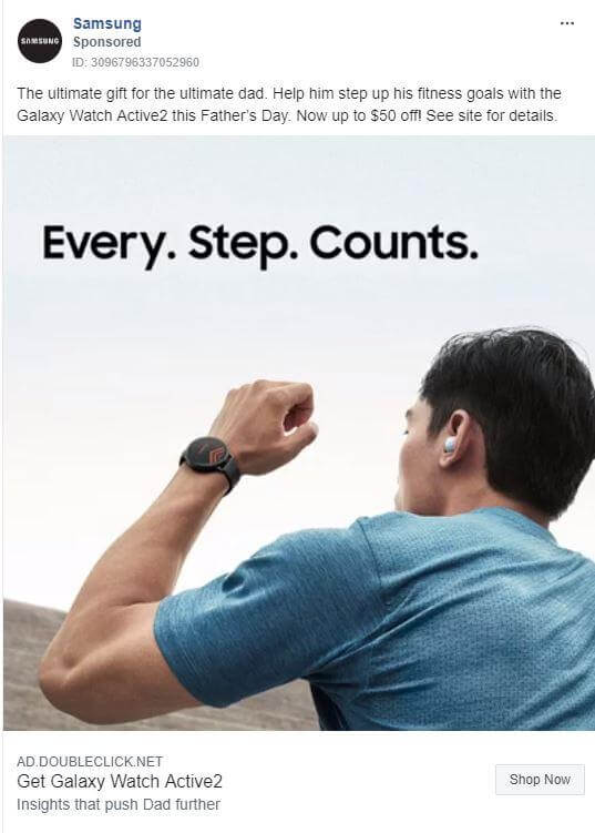
This ad from Samsung ticks almost every box:
- Impactful, three-word headline.
- Simple message.
- Clear benefits.
- Use of power words: “now,” “help,” and “ultimate.”
- The words and image complement one another.
3. Maintain Brand Consistency
Brand consistency builds awareness, creates trust, and makes you memorable, all of which will generate more sales.
When it comes to the design of your ad, brand consistency should be reflected in your:
- Logo placement.
- Color schemes.
- Use and quality of images.
- Tone of voice and personality in your ads.
- Use of fonts, icons, and tags.
As people start to recognize these elements through their consistent use, they will become more aware and trusting of your brand over time.
Example and Why It Works:
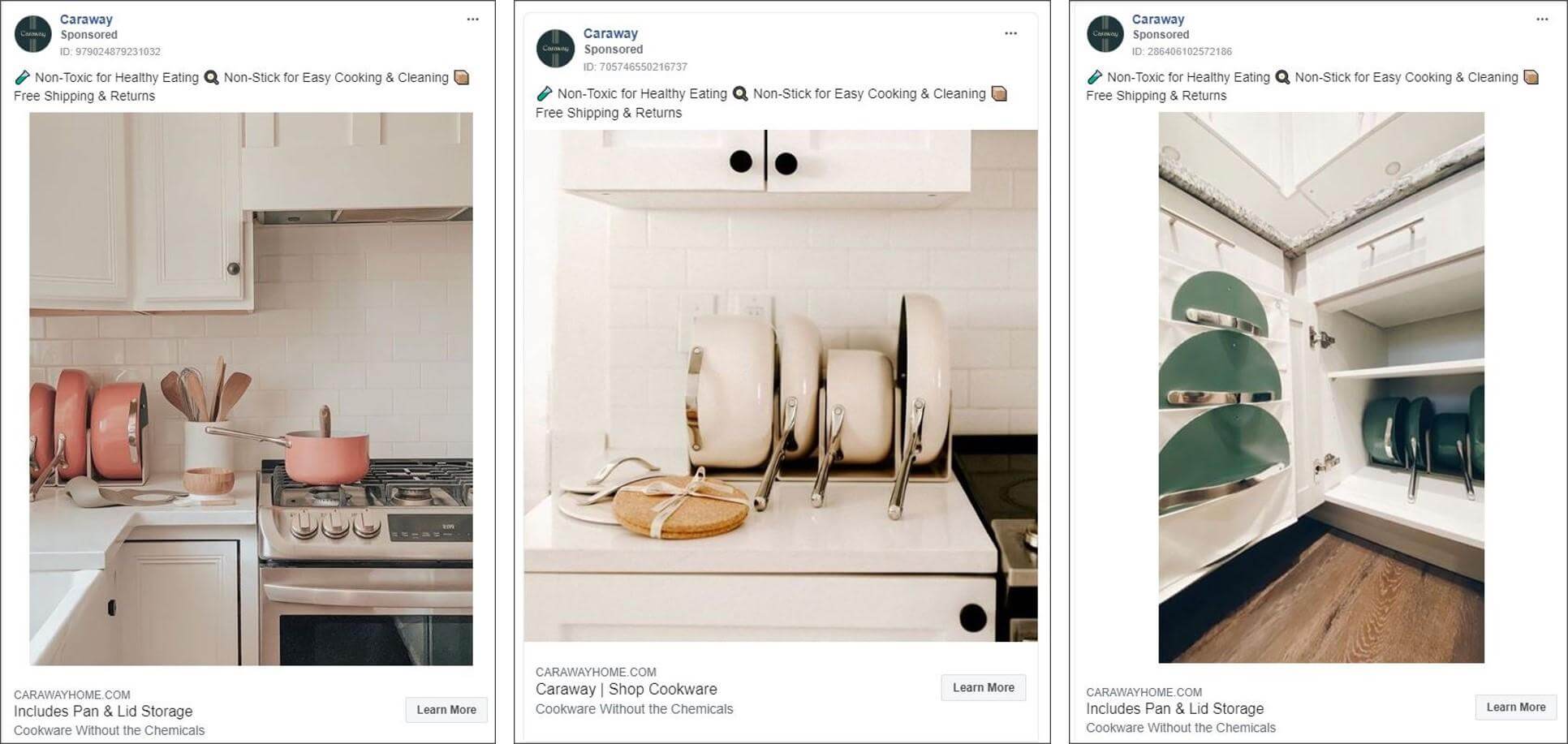
Here’s a series of ads from Caraway, an online retailer of ceramic cookware. Each ad follows through on the company’s strong branding with muted color schemes, beautiful photography, and simple ad copy.
4. Create Video Ads That Demand Attention
According to a 2019 report from digital research authority eMarketer, 60% of Americans who watch digital video do so on Facebook (second only to YouTube). That should be incentive enough to incorporate video into your next Facebook ad. Here’s how to make the most of it:
- Show, don’t tell: Videos are a great medium for demonstrating your product. Again, don’t just cover the features—show how it’s used.
- Make sound an option: We mentioned before that your video should make sense both with and without audio. In fact, Facebook found that most people prefer opting in to audio, and 80% of respondents said that they dislike when videos start playing unexpectedly. Use captions to communicate your message in addition or instead of a voiceover.
- Keep it brief: The optimal length for Facebook ad videos is under 30 seconds.
- Pack a punch upfront: Make an impact in the first five seconds—that’s when people will decide if your video is worth watching in full.
- Make it colorful: If it works for your brand, use bright, primary colors to make it pop off the screen.
Example and Why It Works:
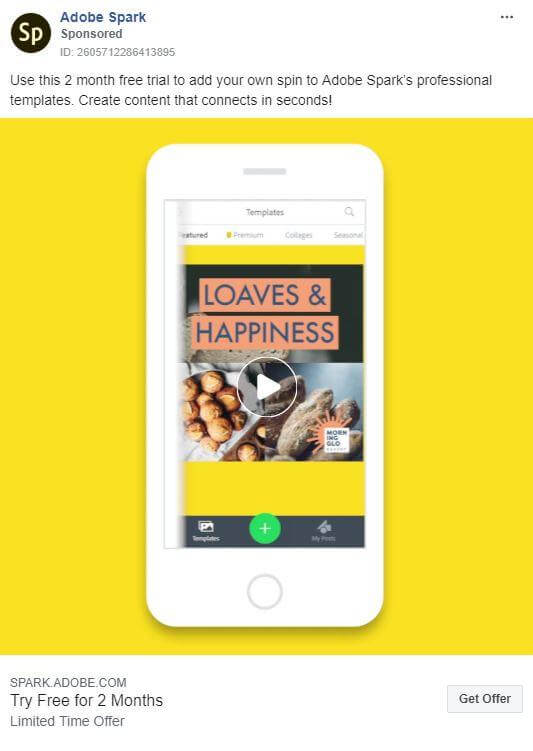
This vibrant little video from Adobe Spark is a great example because it:
- States the core value proposition right up front: “No design experience needed.”
- Tells a story, clearly demonstrating what the software can do for you.
- Uses silent captions.
- Uses bright fun colors.
- Only lasts 30 seconds.
5. Make Them Laugh
It doesn’t matter if you’re selling SaaS products to multinationals or diapers to new moms—all advertising needs to make people feel something and create a connection. The best way to do that is through humor, desire, emotion, or curiosity.
Let’s start with humor: It can make your Facebook ads more memorable and shareable, but only if it’s clear and fits the character of your brand and it’s appropriate to your target market. In the wrong hands, badly executed humor is almost guaranteed to backfire, so use it wisely.
Example and Why it Works:
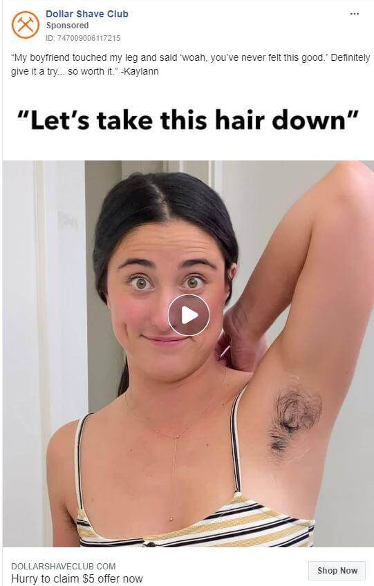
Dollar Shave Club is a master of humor. They have the advantage of targeting a younger audience that’s more accepting of bathroom humor. But they still manage to take an everyday product and turn it into something relatable by using their trademark humor in this headline.
6. Build Their Desire with Classic FOMO Techniques
You can create desire in a number of ways, from offering a free trial period to demonstrating how your product addresses a customer’s deepest pain points. Another tried-and-true method is to induce the real human fear of missing out (FOMO).
Clever marketers take advantage of this fear by persuading customers to act now before the opportunity to do so disappears. You can do this by:
- Setting a time limit on your offer (in days or even hours).
- Emphasizing the fact that stock is limited.
- Making your offer elite or exclusive, by requiring viewers to sign up.
- Encouraging users to click through for an exclusive deal.
- Using power words like “must-have” and “new.”
- Offering a gift with a purchase.
Example and Why It Works:
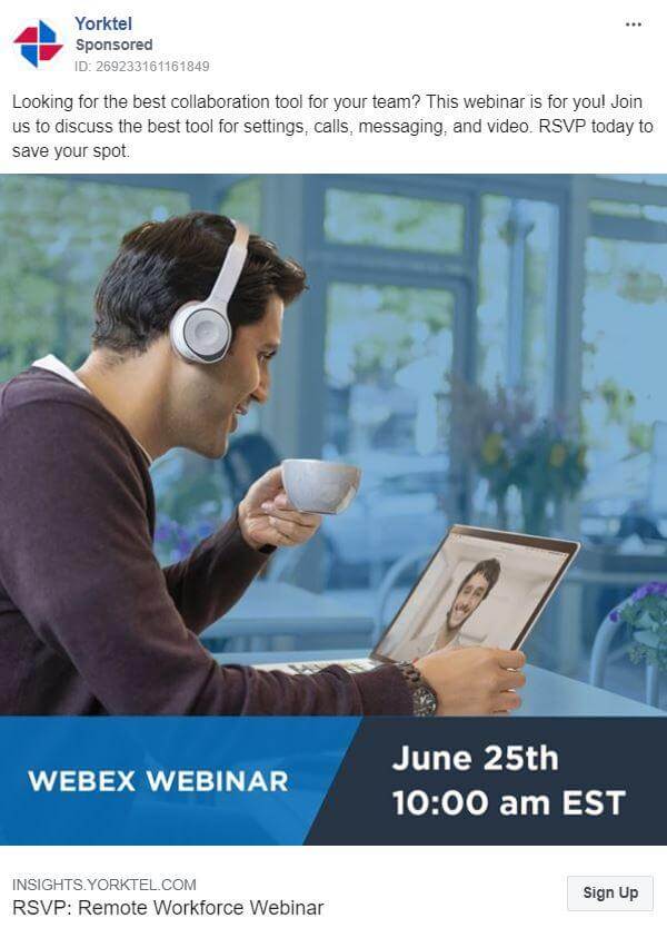
FOMO isn’t restricted to consumer products or sales—it works just as well for high-end B2B services, as this ad from Yorktel demonstrates. Using phrases like “RSVP today to save your spot” is a classic FOMO technique.
7. Get in Touch with Their Emotions
Adding emotion to your advertising copy is about evoking a human response, which comes in many forms. Car manufacturers tap into our need to protect our family when they promote safety features. Lawyers use a sense of justice when they promise to get you the money you deserve after an incident. Charities are well known for appealing to our sense of compassion and even guilt.
Example and Why It Works:
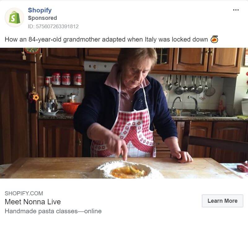
This ad from Shopify uses unabashed emotion to encourage people to click through to its blog.
- Using COVID-19 as a backdrop, it shows a comforting and familiar image of a classic Italian Nonna in her kitchen, doing what Nonnas do best – cooking.
- It also uses the element of surprise, sparking our curiosity about how an 84-year-old adapted when Italy went into lockdown.
This ad campaign from Volvo capitalizes on the brand’s reputation for safety to promote everything from online sales and home delivery to built-in booster seats. It plays heavily on a mother’s emotional need to protect her children:
- The name of the promotion is “Summer Safely.”
- The words “precious cargo” are used to describe children.
- The story-telling technique through the carousel images evokes a happy family day out.
- The softness of the leather and the mother’s touch are palpable.
- The smiling child is safely strapped in and ready to have fun.

8. Spark Their Curiosity
Evoking curiosity is the art of enticing people to click through to learn more about your ad. It’s yet another trusty technique that marketers use on social media and elsewhere.
The best ads tease viewers with just enough information to arouse their interest, but not to the point that they’re frustrated because your messaging is so vague or deceptive. One of the best ways to do this is to ask a question that you know they’ll want the answer to.
Example and Why It Works:
This ad from HubSpot appeals to a viewer’s innate curiosity to build awareness and trust in its brand by asking, “How do you transform your business overnight?”
They’re not selling anything. They’re not even collecting email addresses. They’re giving away free and relevant information in the form of a podcast to businesses in a crisis. Of course, it also gives them the opportunity to run retargeting ads to anyone who clicks through to the podcast.

9. Use Social Proof
Social proof refers to the level of engagement and credibility that you’ve established as a brand. Most often on social media, it takes the form of likes, shares, and positive comments. But in the absence of any organic social proof, you can also use testimonials and client stories in the content of the ad itself. Testimonials from experts and happy customers have always been a powerful way to demonstrate that your product’s claims are legitimate and not just advertising fluff.
Example and Why It Works:
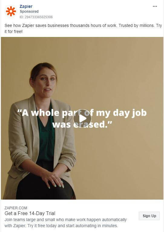
Zapier’s campaign features a satisfied customer telling us how the product changed her day job for the better. Here’s why it works:
- The customer is believable as a real person, not a paid actor. Her words appear natural, not scripted.
- She tells us that Zapier saves her time and explains, in simple language, how it works, combining her testimonial with a demonstration.
- The plain background is a common sight in interviews and reinforces the ad’s legitimacy. It also allows text overlays to be added, strengthening the message. In fact, if you were to watch the video with the sound muted, you’d still understand her testimonial.
10. Embed a Call to Action (CTA)
This possibly goes without saying, but if you really want to know how to do Facebook ads profitably, the one thing you should never neglect is your call to action.
If you look at all the ecommerce ad examples in this post, you’ll find that the CTA buttons vary from Learn More to Shop Now, and a few in between.
But a CTA doesn’t have to be limited to a button. You can include text above or below the image, which gives you more scope to use long-form CTAs.
Use split-testing, try several variations, and remember that a CTA’s job is to instruct people what to do next and to compel them to actually take that leap.
Example and Why It Works:
Ontraport, a marketing automation software company, uses two different CTAs that are perfectly aligned with the goal of the ads:
- Like Page: This is about building brand awareness and a community. There’s no requirement to buy anything. They simply want you to like their page.
- Learn More: This has more of a sales focus, taking people directly to their website, where users can sign up for a 14-day free trial.

11. Create Ads to Match Your Customer’s Buying Journey
Facebook advertising is about nudging prospects through their buying journey (the sales funnel), from awareness to consideration and conversion.
At the start, businesses target cold customers who match their buyer persona. Savvy advertisers begin by promoting free content that’s relevant and valuable. It could be a blog post, a checklist, or a contest. It doesn’t matter too much—the point is that it’s free and useful content that aims to create a connection between your business and the prospect.
Once users have made the initial contact, you can start to run retargeting ads, upping the sales pressure.
Example and Why It Works:
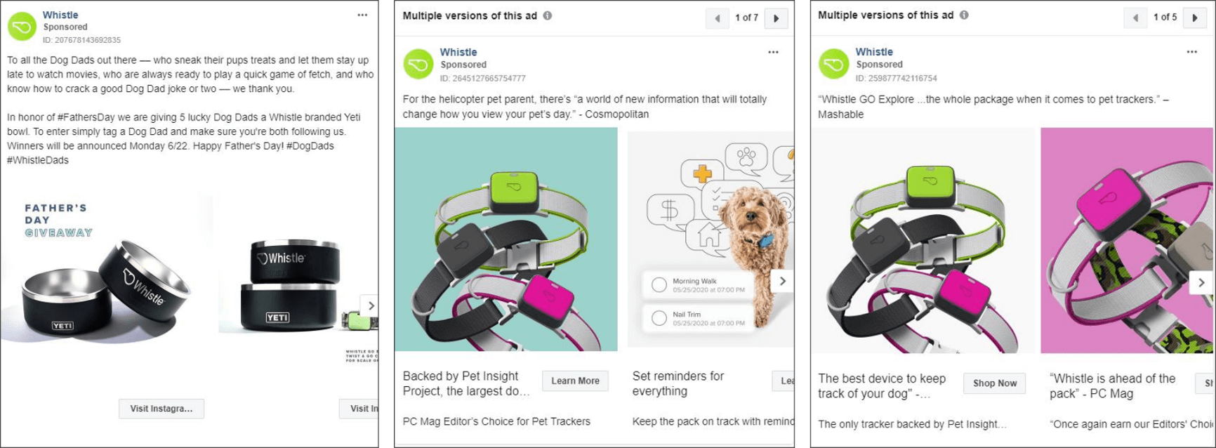
As you can see from this campaign by Whistle (a subscription-based pet tracker), everything about these ads is designed to move people through the sales funnel.
- Awareness: The first ad promotes a prize draw where entrants have to tag someone on Instagram and follow the page to be in the running.
- Consideration: The second ad takes users to a product information video on the website to learn more about Whistle.
- Conversion: The final ad takes users directly to the product page for the hard sell.
Note the CTA buttons at each phase: Visit Instagram, Learn More, and Shop Now.
12. Promote Your Organic Content
A paid ad doesn’t have to start life as a sponsored or display ad. You can pay to boost organic content that already exists on your business page.
The advantage of boosting original content is that you’ve already tested it for free. You know how people are engaging with it. And there’s no word count on boosted posts, so you’re not limited as you are with other ads.
However, because you’re not creating the ad in Facebook Ads Manager, you don’t have the same number of options for bidding and targeting. But it’s still a worthwhile strategy to consider.
Example and Why It Works:
Here’s one of our video ads. In terms of click-throughs, reach, and impressions, it’s been one of the most successful creatives we’ve run in our ad group. That’s because it’s a video instead of an image ad, so it engages people more. And it’s an organic list video, so people see it as content rather than an advertisement and find value in it since people love lists.
13. Know How to Target Your Audience (Or Get Help)
You can design and write the best ecommerce Facebook ad in the world, but it will count for nothing unless you target the right audience.
There are several ways to do this. And while many ecommerce businesses manage their own ad campaigns, it can take some time and effort to master.
Getting it wrong can also be a costly mistake. That’s why it’s a good idea to work with a specialist ecommerce Facebook ad agency to help you plan your next campaign.
But even if you do use an agency, it’s still worth understanding the basics of audience targeting on Facebook. Let’s break this down into the three key areas:
Using Interests Data to Convert Cold Traffic
Facebook offers the widest range of audience targeting parameters, covering everything from demographics and location to behaviors, life events, and interests.
The interests field in particular means that you can drill right down to very specific details to decide who you want to show your ads to using Facebook’s preset data as well as keywords.
For example, if you sell garden supplies, you can target men aged 45 to 65 who own a home, interested in a gardening enthusiast’s Facebook page, went to college, and like growing perennials.
The further you refine the interests of your cold audience, the more likely you will be to deliver relevant and useful content that converts them into a warm prospect.
Converting Warm Traffic with Retargeting Campaigns
Warm traffic is made up of prospects who have visited your website, given you their email address, or otherwise connected with your business. Retargeting these prospects with ads in their news feeds allows you to:
- Reinforce the benefits of your product.
- Remind them of their abandoned shopping cart.
- Make them an offer that they can’t refuse.
To have effective retargeting, there’s two ways. First, you can install a tracking pixel on your website to build your targeting list. This pixel collects data on all of a user’s touchpoints on the site, which provides a lot of useful information to make your ad targeting relevant.
Another way is to upload an email list that you already have of prospects or customers that you’d like to target. This upload will create a custom audience you can target.
Use retargeting if you want to convince people who didn’t buy the first time, push them further down the marketing funnel, or entice customers to purchase again.
Targeting Look-Alike Audiences
This is somewhere in between throwing a net out to a cold audience and retargeting known prospects.
When you upload a list of your existing clients’ email addresses into your ad manager, Facebook will use AI to analyze their profiles and match them to an audience that is as similar as possible. The results can be as successful as what you’d get from a retargeting campaign because it’s almost as though you’re advertising to an already warm audience. Use look-alike audiences if you have a strong email list that you’d like to find similar people to.
14. Test and Test Again with Multiple Versions and Split Testing
There is only one way to know if your ad is working optimally, and that’s to produce multiple versions and split-test them (also known as A/B testing).
You can split-test everything, from the words in your headline to your images or the color of your CTA button, as well as your target audience, bidding, and so on. However, some elements can have a higher impact on your key metrics than others:
- Low impact: image and copy tweaks may net you a 1–15% improvement.
- Medium to high impact:
- Title of the content/asset: 50–150%
- Landing page: 2–5x
- Sales or nurturing process: 10–20x
It’s also best to limit your split-testing to no more than two or three variations of the major elements at a time. Otherwise, you’ll never be able to manage the data you collect or come to any meaningful conclusion about the results.
For example, you could perhaps start with a couple of different images and then go on to test other smaller elements of the ad using the better performing image. That way you refine the details of your ad, split-testing them as you go, and scaling up Facebook ads in your campaign to get the best possible ROI.
Example and Why It Works:
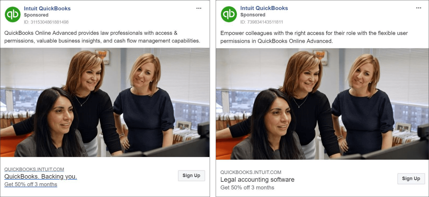
This is a classic split testing example from QuickBooks accounting software. The product, image, offer and CTA button are the same in each ad. This is either because they know that these elements work or they haven’t yet tested them.
What QuickBooks is testing here is the copy that outlines the benefits, both above and below the image. Once the results are in, they can then go on to refine and test other variants as necessary.
Use Facebook Advertising to Increase Your Conversion Rates
The best ecommerce Facebook ads aim to target the right people at the right times with relevant and useful content. They use impactful visuals, compelling copy, and CTAs that connect and convert at every step of the buyer’s journey. Be sure to use these metrics to gauge your success since they’re the most indicative of performance: link clicks, CTR Link, Relevant Score (ad level), frequency, results, and cost-per-result.
We hope these 14 tips, tricks, and examples inspire your next Facebook advertising campaign and improve your conversion rates.
Most newsletters suck...
So while we technically have to call this a daily newsletter so people know what it is, it's anything but.
You won't find any 'industry standards' or 'guru best practices' here - only the real stuff that actually moves the needle.
