How to Train Your Designer: 4 Philosophies To Design (and Live) By
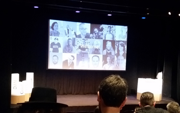
A few weeks ago, I attended the Awwwards Conference in NYC. Although it was my first, it was without a doubt one of the most influential conferences I think I’ll ever go to. Instead of talking about case studies and work strategies, many speakers spouted inspiration on topics ranging from how ordinary people change the world to letting your “wild side” run free.
During my time at WebMechanix, I have learned first hand about the nuances of the design world. My job isn’t just about making things look “pretty”. A good designer is able to take a template and improve upon it. A great designer is able to start from scratch and ensure every detail is reimagined for the world it’s being thrown into.
After considering the speakers at this conference and the things I’ve learned over the past couple of years, I’ve come up with four philosophies to design and live by:
1) Thoughtful User Experience
Many designers are taught to create around the content that they’re given; seldom do they design for what’s missing. When thinking about user experience, it’s important to consider the relationship your product has with its user base.
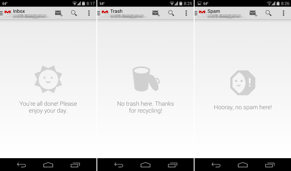
Sure, many designers “accomplish” this through user testing, but users often don’t know what they’re missing until they see it. This is where thoughtful user experience comes into play. If you’re like me (one of the very few designers avoiding Apple), you use Gmail. Now, of course, many of us will never see an empty inbox, but think about what happens when it is empty–does it display “No Emails at This Time”, or does it do something fun and whimsical like a happy sun saying “No Emails, Enjoy Your Day!”?
It’s subtle experiences like these that make user experience go from good to outstanding. Google reimagined the solution around an empty inbox to give us something to look forward to. It sets Google apart from other emailing services that don’t have anything in place for empty states.

When considering thoughtful user experience, remember to have fun designing and make sure that every state within your product can draw some sort of emotion out of your users. Which brings me to my next point…
2) Design with Empathy
Not only does a designer need to think about things from a creative aspect, but they also need to put themselves in their user’s shoes.
One of the best speeches at the Awwwards conference was given by Mike Monteiro. He was the first presenter and man, did he hit hard. He started by telling us all we’re not special and we shouldn’t strive to be. It’s those that are ordinary that are the ones who change the world.
And with that, I realized you need to design for people, not for designers.
There are several ways to go about this: user testing (and a lot of it), research your audience to understand how they can relate, or, the best solution, hire your audience.
For example, if you’re the one who designed Uber, you originally thought it was only to be used by people who needed a ride. But what wasn’t considered was the number of sexist male drivers picking up vulnerable woman going out for a night on the town.
Had the all-male founders of Uber thought about designing with empathy (and hired women who encountered this issue with taxi drivers), they could’ve put a filter in place so you could request a female driver for a female audience. Obviously, there would need to be additional solutions, but it’s a start.
If you’re not able to hire within your audience, you will need to be able to, as Jon Burgerman put it, use what you have and…
3) Encourage the Ferret
The best talk out of the whole conference–at least in my opinion–was by doodle artist Jon Burgerman. The basis of his speech was a video of a ferret running onto a soccer field in England and the players (who had no experience in catching ferrets) needing to catch it. It was entertaining, but it brought up a good point: how do you do something that you’ve never done before? Well, it’s pretty simple… you test it!
When you let your ideas run wild, you’re bound to come up with something unique and completely out of the box. But the only way that you will know it’s good is if you let the idea loose into the world to let it find its place. If it doesn’t fit in, you know it wasn’t a good idea (or you haven’t found the niche for it), but if it does, you’ve then used what you had and tried something no one else has.
But just because you found some place where this idea belongs, it doesn’t mean it’s a hit. Think about it. Good design doesn’t guarantee a hit.
It sucks, but it’s true. We’ve all had those instances where we’ve presented an outstanding idea to a client, backed by all the knowledge we know, only to have it fall flat on its face.
But you know what? That’s okay. You tried. You used what you had available to you (like the soccer players only having their hands and feet to catch a biting ferret), and you encouraged your inner ferret.
Which brings me to my final point…
4) Drink Good Beer
When you don’t settle for the cheap trends (or Coors Lite), you become a great designer. You thought about what it’s like to have a positive and fun experience, you gave yourself empathy because you were on the receiving end, and you encouraged your wild side to try something new.
A leap of faith has no price. And when you learn to love the unknown, working with your audience, and designing experiences that resonate, you’ll learn to love drinking good beer.
Most newsletters suck...
So while we technically have to call this a daily newsletter so people know what it is, it's anything but.
You won't find any 'industry standards' or 'guru best practices' here - only the real stuff that actually moves the needle.


