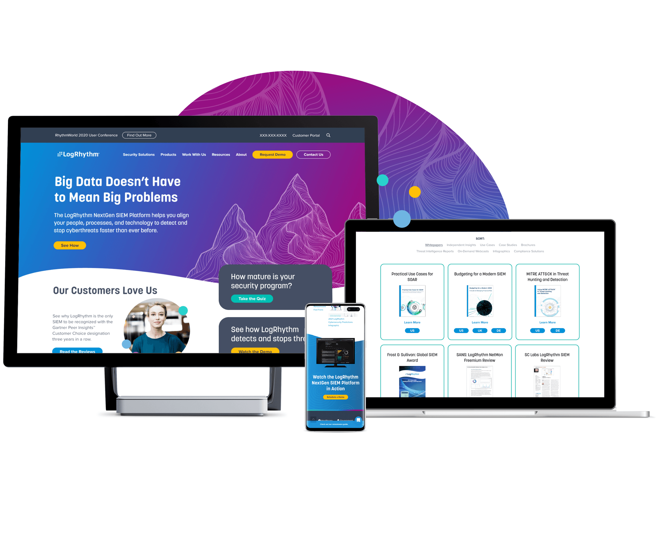
Out-of-the-box design brings big data platform to life
- UX Design, Web Design
- Web Development


As a leader in the security operations space, LogRhythm had a wealth of highly-detailed technical information to communicate, but their old site obscured said information behind a difficult-to-understand design. Through extensive use of bright colors, soft shapes, and curved edges, we ensured the new design would feel distinct in the often-cold security ops space. Beyond the look of the site itself, we refocused the site’s content on LogRhythm’s users, adding a customer callout module to create a more human-centric experience.