How an association elevated engagement with a web redesign
- Web Design, UX/UI
- Web Development
- SaaS Consulting, Analytics


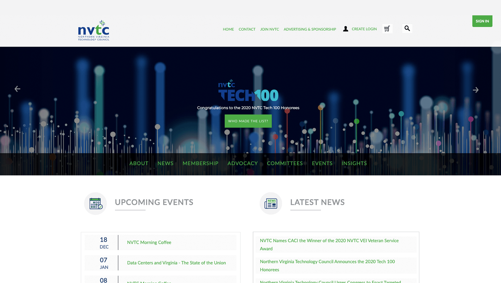
Though somewhat recently redeveloped, the design of the NVTC website was already outdated and inconsistent with the trajectory of the organization. The associated color palette of the old site was also incompatible with web accessibility standards.
Additionally, the website was not organized in a way that was easy to navigate. This caused difficulties both for existing and prospective members looking to engage or become members.
To add further complexity to the project, NVTC needed to maintain certain pieces of functionality — such as login and ticket buying integration — while at the same time overhauling the website for usability. There was a delicate balancing act required between re-envisioning the site and retaining the pieces that made the website work for its members and stakeholders.

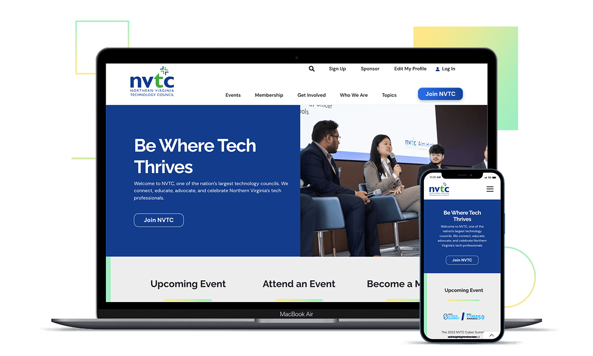
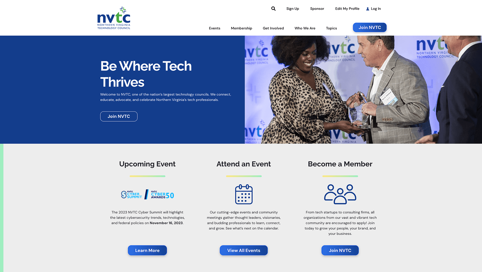
With the goals of NVTC’s stakeholders & its desired future in mind, WebMechanix produced a fresh, modern design for NVTC that reflected the forward-thinking nature of the brand.
Our team paid particular attention to the color palette & styles via multiple rounds of revision to ensure they were compliant with both web accessibility standards and NVTC’s brand vision. We also carefully guided the NVTC team through multiple revisions of their homepage design to ensure we nailed the messaging and flow of that “first impression” experience.
Working closely with NVTC internal teams, we also re-architected the site with the needs of NVTC’s member & prospective member stakeholders in mind.
The navigation and UX were updated to make the key actions users take on the website (like becoming a member, signing up for events, etc.) as accessible and intuitive as possible.
To maintain the functionality of the site, WebMechanix’s development team partnered with NVTC’s association management software vendor IMIS and the client to ensure the member portal and ticket buying integrations stayed operational on the new site.
Midway through the project, the project manager on NVTC’s team left for another opportunity. This resulted in some loss in background knowledge and structure as they transitioned project ownership internally.
To support this transition, WebMechanix worked closely with the new PM on NVTC’s team to ensure minimal interruption to the day-to-day, keep feedback cycles moving and get continued stakeholder buy-in as the project progressed.
After launch, the difference couldn’t be more clear.
The website had dramatically improved usability and aesthetics, with website engagement metrics rising substantially post-redesign. In addition, the website is far more mobile-friendly, improving the experience and engagement of mobile users.
Perhaps just as importantly, the backend of the website got a major refresh. The small-but-mighty NVTC team is now empowered to easily update their own content across the entire website.

