62% more conversions with web redesign
- Web Design, UX/UI, Animation
- Web Development
- SaaS Consulting, Analytics


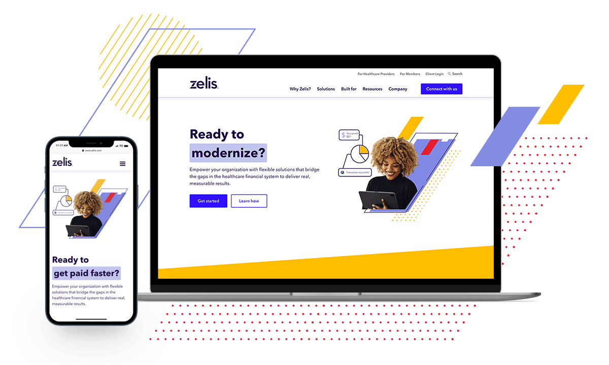
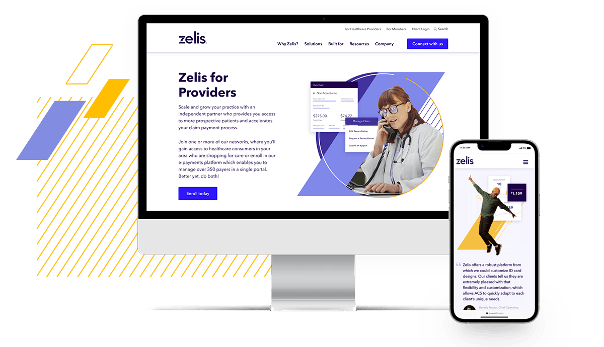
Zelis was evolving their brand to make it more modern and aligned with their value proposition of modernizing healthcare. Zelis engaged with WebMechanix to roll out these updates to their website. The website also needed some architectural updates to ensure their products and solutions were accurately and fully represented.
At the same time, Zelis had also been undergoing the acquisition of a handful of companies, two of which aligned directly with the launch of the new website. Furthermore, interviews with external stakeholders revealed that the site was hard to navigate, making it difficult for customers and partners to find the right information for their needs.
In short, Zelis.com needed a reboot: a user-friendly website, optimized for conversion that represented the Zelis brand and products well.

WebMechanix started by reviewing the data to understand the requirements for the new website. The team gathered insights from the Zelis marketing team, including the team member managing Content Square to pinpoint the gaps in the current user experience. We also analyzed previously-conducted stakeholder interviews.
With these insights in hand, the design team dove into wireframes, creating 15 page layouts and 30+ components (including different variations). The information architecture build was a smooth transition – we maintained the existing top-level navigation, but reworked the sitemap to incorporate Zelis’s new products and services.
Midway through the project, Zelis found they needed to accelerate the project timeline to be able to have the new website ready for an upcoming conference. This meant we needed to reduce the design phase from a standard four month timeline to two weeks, while moving the launch of the site up by a full month. Both teams agreed we would need to get creative about how to pull off this abnormally difficult timeline.
Here’s how both teams rose to the challenge:
Zelis’s incredible team deserves immense credit here — they pushed through many content revisions in short order to get the new content ready for the website. This was supported by hard content deadlines, close collaboration for content entry and additional entry resources from WebMechanix.
We then moved to development, working in tandem with the Zelis team to build the backend ASAP to make it easy for them to add content in. While the Zelis team added their content with augmented support from WebMechanix, WebMechanix built the front end experience.
In the end, it was an all-hands race to the finish. But we launched on time! And even had a few days to polish things before the conference.

Not only did the website launch go off without a hitch, but the results speak for themselves.
Here are just a few of the “before/after” launch highlights from Google Analytics, period-over-period:
In other words, we saw traffic, engagement and conversion metrics improve substantially over the old website. Both the Zelis and WebMechanix teams were thrilled with the outcome!