How to write B2B emails that actually win new customers
Email is one of the oldest marketing tools available within the digital landscape, and it still remains (by far) one of the cheapest ways to generate and nurture leads. In fact, email boasts an insane return on investment (ROI) of roughly 40:1. So if you’re not using this channel to drive revenue, you almost certainly should be.
And in the world of SaaS email marketing, you’ve got rich user data living right inside your product that you can use to uncover even better opportunities to drive your email marketing strategy. It pays off to integrate that product data with your marketing data—the benefits easily outweigh the time and effort required to do so.
But where do you start? And if you’ve already started, how do you improve performance? Have no fear, friend, because this guide will teach you how to write B2B emails effectively and answer all of your questions!
The many benefits of email
Unless you’re spamming people, you have very little to lose—and potentially a lot to gain—from incorporating email into your marketing strategy.
It’s personal. We marketers get to know our prospects and customers very well by collecting lots of information about how they engage with our brands. Thoughtfully applying that information to personalize the email experience gives you a much better shot at getting in front of the right people at the right time. And that leads to new business and upsells.
It’s scalable. There’s an expression we love around here at WebMechanix: With marketing automation, you can have your cake and have robots feed it to you. You can send the same personal email to one person or to one million people. Of course, you have to be careful about how you segment the recipient groups (more on segmentation later). But as long as you’re diligent about whom you’re emailing, the how is pretty much a constant. It’s all about making your marketing automation and CRM platforms do the heavy lifting.
It’s trackable. Perhaps my very favorite thing about email as a marketing channel is that it’s super simple to understand its performance. If folks are interested in what you have to say, they will engage. And your platform will instantly give you clear reporting that you can use to help shape future messaging and strategy, not only for email but also for other channels.
Now, before we jump into the nuts and bolts, let’s look at some quick tips for reinforcing your brand with email.
Set the tone for your brand
Sure, a new contact or existing customer has almost certainly seen your website and possibly some other assets to establish some familiarity with your brand. Email is generally a more personal interaction since we marketers are actively reaching out to individual people—even if we’re sending out one email to a larger group. And because email is an interruptive marketing tactic, how you use this channel will tell your contacts a lot about your brand. Here are some tips for leaving a good impression.
Be valuable
Your leads and customers want to know more about what they’re actually interested in. When you’re emailing them, be educational, not overly promotional—especially about what you’re selling. For example, if you’re in SaaS, it’s unlikely that your prospects will be interested in all the effort that went into developing your platform. Instead, they’ll want to know how this is going to change their lives. Is your software going to help them earn more? Convert leads at a lower cost? Be sure to communicate those benefits.
Be consistent
Most companies have lots of people sending emails on your behalf between marketing, sales, and service teams. It’s always a good idea to have some sort of centralized process to ensure that messages are at least generally aligned with how you’d like your brand and products to be positioned. The size of your company usually dictates the amount of alignment required—the more employees and departments you have, the more effort it will take to ensure that you’re all on the same page.
Be respectful
Most people are pretty busy. We’re bombarded daily with thousands of marketing messages in the form of digital and print ads, social media posts, commercials, and, of course, emails. So don’t hit up the inbox more than you need to. Additionally, try to make sure that messages sent by your sales team aren’t overlapping with emails sent by marketing and vice versa.
And don’t ever send email campaigns at odd hours. While you may be burning the midnight oil, your contacts likely won’t enjoy hearing from you when they’re trying to wind down after a long day so they can spend time with their family. You can always schedule your campaigns for a specific day and time when you know your prospects are going to pay attention to your messages.
One really important consideration of any email strategy is cadence, or the number and timing of emails. Some companies send out lots (and lots) of short email messages and manage to keep engagement high. Their cadence might be every other day at 10 am. Some cold email strategies rely on getting a large number of impressions, so they spam you to death to get precious few positive responses. Those senders are almost always breaking laws and clearly demonstrating a lack of respect for recipients’ time.
vOn the other hand, some folks prefer to minimize frequency but send longer emails. If you’re pursuing an aggressive cadence, keep a close eye on the story your engagement data is telling you. It may seem like an aggressive strategy “works” for your business, but you’re most likely annoying your nonresponders to the point of never, ever wanting to buy from you.
Pro Tip: Set up sending frequency caps to prevent excessive overlap between your nurture campaigns and promotional email blasts.
The anatomy of a great marketing email
Pretty or plain?
It’s commonly accepted that B2C emails should be “pretty” and B2B emails should be “plain.” The truth is that there are many factors that go into the look and feel of your email, like purpose, audience, tone, and your call to action (CTA).
For example, if you’re sending a campaign that’s attempting to make 1:1 contact between, say, a salesperson and a lead to book a meeting, it should probably feel like someone wrote the email directly from their inbox. That is, the email should be very simple: dark text, white background, short and sweet. On the other hand, if you’re sending a newsletter or unveiling a new feature or service, you may want to punch up the pizzaz. Go for color and images with clear CTAs.
Your design choice is a great area to do some split testing to see whether pretty or plain emails work best for your brand.
From name
It’s all in the name, right? Emails from real people feel infinitely more personal. Be sure to send your emails from a real person’s address within your company. Ideally, that employee should be someone the recipient knows [of] or would like to hear from, like someone from the C-level or their account manager. Consistency is important, too—pick one name to send the bulk of your emails.
From address
This should also feel personal. No one likes getting emails from [email protected]. If you’re worried about using your CEO’s real email address, you can always use a different, dedicated address so she doesn’t get flooded with hundreds of out-of-office replies. One little cheat I like is to create an email address that sounds like it’s really the sender’s email address but is actually a distribution list.
So if your CEO’s name is Sarah Smith and her real email address is [email protected], you could create an account for [email protected] that’s either a distribution list for your sales team, goes to an operations person, or whatever else is clever.
Subject line
Well, this is nearly the most important part of your brilliant email. A lot has been written about what’s considered “good” when it comes to email subject lines. But to really find what works, you’ll need to get creative and split test. At a company I previously worked for, I meta-analyzed subject lines and found that ones beginning with a verb were getting substantially higher opens than ones that didn’t. In fact, one of the best performing subject lines I’ve sent at WebMechanix was simply “Looking Forward.”
Each audience is different. Sometimes, even within one company, you may have unique personas that require totally different messaging. Try a few broad approaches and see what works best to guide your strategy.
Preheader
This element goes by a few names. Maybe you know it as a preview, teaser, or even a Johnson box. It’s the snippet that shows up alongside the subject line in an inbox. Think of it like an ad for your email that further entices the recipient to open. It should be both interesting and relevant to the email’s subject. Many email marketers, myself included, think of the preheader as an extension of the subject line. Here’s an example from The Honest Company:
Subject line: Treat Yourself to a Free Gift
Preheader: While supplies last, you can get a free Halloween tote with any bundle…
In this example, the preheader is supporting the subject line by giving the recipient more information about the offer. Personally, I’d use a different subject line to stand out a bit, like “We Have A Special Gift for You.” That version plays on the law of reciprocity by insinuating instead that the company has something to give rather than the recipient having to take action to get their freebie (“Gift for You” versus “Treat Yourself”). Nonetheless, the subject line and preheader play well together.
Content
Well, well, well… Here we are at the heart of the matter. If all went well, your recipient recognized the name and address of the sender, became interested in the subject line, found the preheader intriguing, and landed you that Almighty Open. Each of those actions is called a micro-conversion, and many consecutive micro-conversions lead to the macro-conversion or primary CTA. And here’s where your content gets to shine!
When you’re writing email copy, there are a few things to consider. First and foremost, you need to segment your audience. Let your audience—and, more importantly, what you know about them—guide the tone of your message. Are they already close to a monthly limit? How about whether they’ve viewed other products in the past?
Bonus points: You can (and should) use your content as a testing ground for the messaging and tone of your products and services. Try swapping out a paragraph or set of bullet points and split test to see what resonates best. Email is very good at shining a light on the overachievers in the room—remember that people either open and click, or they don’t.
And if you happen to send emails that are more visual than verbal, try a new style of artwork or change the design system to use a different color palette or font hierarchy. Try using pictures of people instead of pictures of your product or vice versa.
CTA
When it comes to how to write B2B emails, make it memorable, scannable, and make darn sure you have a clear CTA for recipients to engage with. If you’re going for a plain-text look in your emails, keep it to one or two links if you’re attempting to get a conversion. People don’t like friction in the decision-making process, and each additional link adds confusion about what to actually do. That said, adding more links is fine if you’re simply sharing information and not looking for recipients to take a specific action.
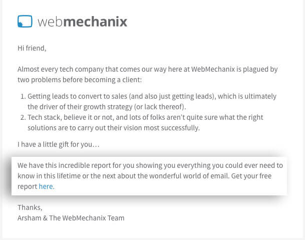
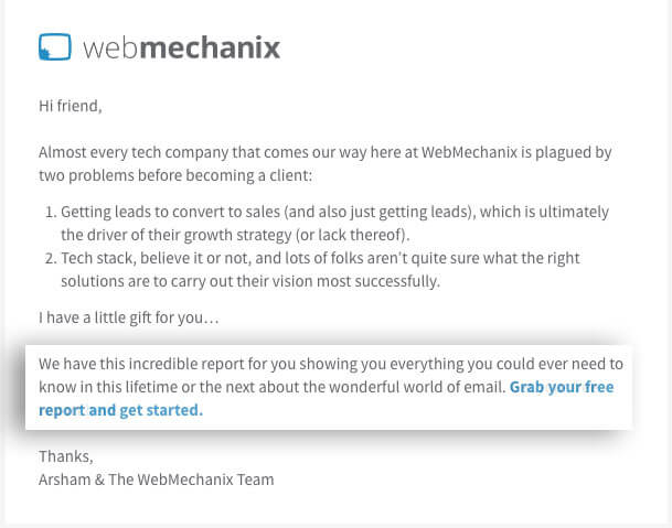
Furthermore, the copy you use for your CTA also matters. Keep in mind that it’s a call to action, so it needs some direction. Check out these two examples:


The only difference in these two emails is the CTA. The second version is telling the recipient in clear, friendly language exactly what to do. Plus, it stands out visually for folks who scan email instead of reading it because more words were hyperlinked.
If your approach relies on smart design over smart copy, there are a few things to remember when you’re developing the look and feel of your CTAs:
- Be sure your buttons are bulletproof, meaning that they don’t rely on images to render. Instead, use ordinary links styled with CSS to look like buttons. Check out the section below on email rendering for more details.
- Make sure the full button area is able to be clicked and tapped. Oftentimes, senders will simply link the button text rather than the full button. Consider your user experience and make sure your buttons look and work just like they would on a webpage.
- If you’re using multiple CTAs, be sure to give the most important one the weight it deserves. Place that primary CTA as high up in the email as it makes sense, and use the boldest colors available in your palette.
- Be careful with red, though. The human eye has a different set of receptors for the color red, which is often associated with either pleasure/intimacy or danger. Thus, using it will most likely either give you a bump or dip in performance, depending on your goals and audience. As with most things in the digital world, nothing tells you the complete story like a good test 🙂
Hopefully, these B2B email marketing tips have been helpful. What is your biggest struggle when it comes to how to email market effectively?
Need help? Check out our B2B email marketing services.
Most newsletters suck...
So while we technically have to call this a daily newsletter so people know what it is, it's anything but.
You won't find any 'industry standards' or 'guru best practices' here - only the real stuff that actually moves the needle.


